Overview
Groupla is an app designed to simplify and enhance planning group trips. It allows all travelers to collaborate, choose activities, and consider the entire group's interests.
The Problem
It is often the case that only one person is responsible for deciding the itinerary by using multiple apps, which can be time-consuming and neglect the interests of other travelers.
The Solution
To address this issue, I designed an app that enables all traveler members to plan a group trip, ensuring they have a voice when deciding the itinerary. And all done mainly through only one channel.
My Role
As my first personal project, I conducted it on my own, though it wouldn't have been possible without the valuable help and support of my family and friends.
My contribution
UX Design UI Design
The team
Mel Navarro Bento
Tools
Figma Pen & paper
Process

What's the challenge?
- Group travelers have different interests for what to do and see, but not all of them are always considered during planning.
- Planning trips often require multiple channels to craft an itinerary.
- Communication platforms for organizing trips can get overwhelming when messages, links and photos accumulate in a group chat.
Research Phase
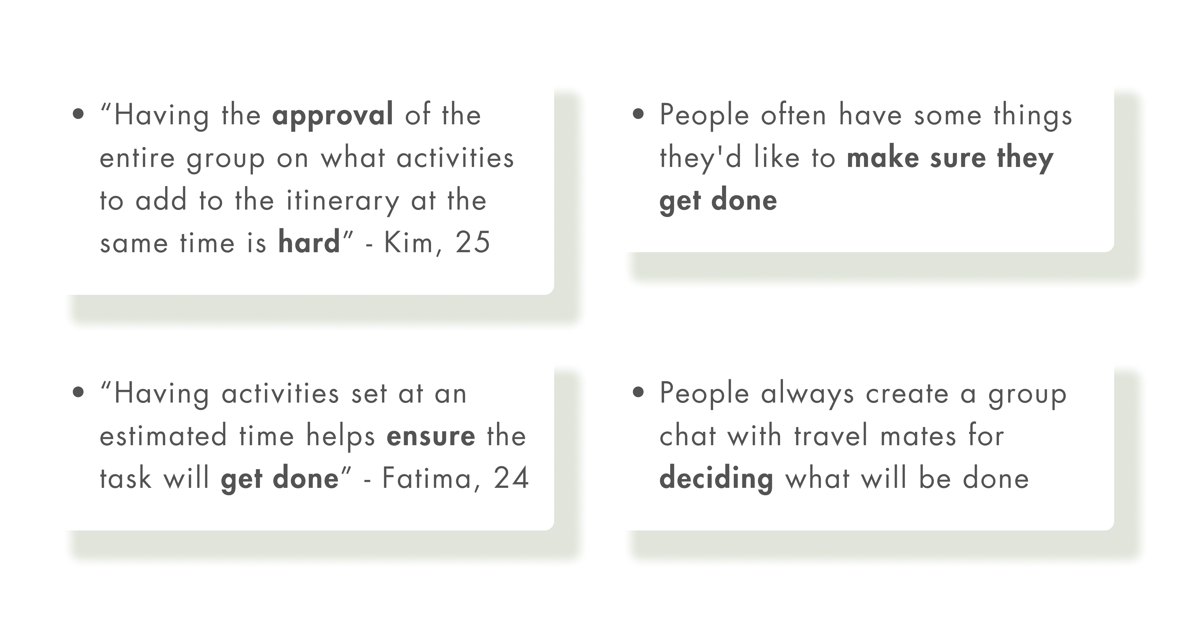
I conducted User Interviews in order to get closer to and empathize with travelers. Through research, I was able to identify a primary User group: young adults who travel often and almost never do it alone. Here are some insights and quotes I got from them:
Next I conducted a competitors analysis to identify opportunities in the market, spot weaknesses in a competitor’s user experience and, finally, to create sustainable competitive advantages. I identified 3 main competitors:
- Lambus
- Check my Trip
- Trip.com
I noticed that the focus is on booking hotels and/or activities, and not so much on the itinerary or planning part. There isn’t a way for travel groups to communicate, nor a strong leverage on visualization of recommended/suggested activities.
Here is a shot on my analysis on Lambus.

Link to complete competitors analysis
User Proto Persona
Insights from User Research helped me create a proto-persona. I identified Sofia's goals and needs, which were later useful to generate an hypothesis statement.

So, what problems does Sofia face?
- She doesn't want to miss visiting specific places while traveling
- She doesn't like unorganised planning
- She looses too much time on social media trying to find inspiration based on her personal interests
With this in mind, I was able to the define the problem. For this I used the How Might We statement, which helps to reframe the insights into opportunity areas on problems found during User Research...
HMW help Sofia create an organized group trip itinerary and find inspiration of places to visit while taking in account the interests of her travel companions?
Hypothesis Statement
This was my first attempt to solving the primary problem of Sofi. I explored one potential solution:
"We believe that by building a group trip planning app that provides a single platform for all travelers to express their opinions, Sofia can have a successful trip that meets everyone's needs and interests while also ensuring organizational efficiency."
UX Design
Task Analysis
Based on the defined problem, the next step was to understand the Information Architecture. I created a Task Analysis to know exact actions Sofia will have to undertake to accomplish two relevant tasks: adding items to the itinerary and accepting friends requests:

User Flow
Based on the User Task #2 I created a User Flow to set the paths that users will follow as they navigate through the app to achieve the goal. In this case, the user adds a request from a friend to the shared itinerary and marks it as important:

Wireframes
I built low/mid fidelity wireframes for all screens of Groupla's flows to start prototyping and testing. Here the User Task is adding a place to stay to the itinerary:

Usability tests
I conducted six usability tests on low/mid fidelity wireframes to learn, at an early stage, what issues were people having in completing tasks. It is also ment to test key functionalities to ensure the app functions properly.

I fixed the issues by making the calendar icon open a calendar and separating the check in/out subtitles from staying in from/until input fields.

After the test, changes were made and displayed in the high fidelity/final form:
High Fidelity
I must say, it felt nice to start using colors and make use of more visuals. Here the User Task is to add a place to stay to the itinerary:


Visual Design
What kind of feeling do I want users to experience while using Groupla? The color green is associated with refreshment and peace. This is the primary color used. I used a sans serif font so it is more legible and friendly.

Ideation

Outcome
Groupla, an app designed to simplify and enhance the collaborative process of planning group trips. It allows all travelers to select activities together while taking into account their individual special interests.
Key Features
- Create an itinerary
- Communicate with travel mates: comment and chat
- Highlight interests and receive personalized recommendations
- Find inspiration for the trip activities

